

← All work

Case study

An all-in-one platform for natural medicine care, from first diagnosis to treatment plan

I-Health is a platform that helps people find the right alternative therapy. AI suggests a diagnosis or a clinical plan, and a certified therapist reviews it before it reaches the user. I took it from concept and UX research to UI design and a prototype.

  • Web platform
  • AI
  • Wellness
Year
2023
Role
Concept, UX research and design, UI design, prototyping
Tools
  • Figma

01 — Context

Where this project started

I-Health started with one goal: to give people a fast, professional diagnosis from an alternative therapist, based on AI technology. The user describes the problem, and the AI turns it into a differential diagnosis or a clinical plan, drawing on evidence-based guidelines, schemas and case studies. Once the diagnosis is ready, a certified therapist goes over it and adapts it where needed.

02 — Problem

So many options, no clear path

In recent years, awareness of natural and alternative therapy has been growing, and many people now look for it, for anything from a cold or the flu to more complex conditions. But they don’t always know which therapist to turn to, and often no suitable therapist is available right away, even though many mild illnesses can be treated naturally, quickly and effectively. I-Health covers both: for simple cases, it gives recommendations that a certified therapist reviews, and when someone needs more, it helps them find a relevant therapist who is available and close by.

03 — Research

How I studied the problem

Part 1 Usability research

Learning from AI and wellness products

Looking deeper, I found what makes I-Health valuable: AI and a human working in the same process. So I widened the research to products with similar features, ChatGPT, Headspace and Glass, and looked to them for inspiration.

  • ChatGPT
  • Headspace
  • Glass

Part 2 User research

Meet Gili

To understand what people need and want, I interviewed potential users about what gets in their way when they look for an alternative therapist. From these insights, I built a persona that represents the people I was designing for.

Gili, the persona

Gili W.

Age
31
Occupation
QA
Location
Tel Aviv

Bio

Gili lives in Tel Aviv with one roommate and works for an ERP company as a developer and QA tester. Surfing is one of her favorite pastimes: she goes on surfing trips several times a year and works remotely while she’s away.

Pain point

  • She suffers from recurring urinary infections and often takes antibiotics, which weakens her immune system.

What she expects from the platform

  • She believes in alternative therapy, which treats the whole person rather than just the symptoms or the disease: the physical, emotional, mental and spiritual sides.
  • She wants to use the platform when she’s out of the country, and whenever she needs it.
  • She wants to stop needing antibiotics again and again, and to strengthen her immune system naturally.
04 — Insights & approach

Turning research into a UX

The research made the direction clear: what makes I-Health valuable is AI and a human working in the same process, so every diagnosis has two steps. The AI drafts it, and a certified therapist checks it.

Step 1

The AI drafts the diagnosis

The problem the user describes, together with evidence-based guidelines, schemas and case studies, becomes a differential diagnosis or a clinical plan.

Step 2

A certified therapist checks it

Before the diagnosis reaches the user, a certified therapist reads it and adapts it where needed.

05 — User flow

A short route to the right therapy

Landing page
Product
Blog
Therapist
Contact
Login
SignupProfile information form
Item – AI User and AI conversation A human therapist checking the diagnosis Profile page with new diagnosis notification

06 — Design system

One UI style guide for every screen

Colors

Colors

  • #FBF7F5
  • #E2D8D3
  • #EDD7CF
  • #C29792
  • #EAEDEC
  • #626D6B
  • #313736
  • #E2D8D3 / #FBF7F5
  • #E2D8D3 / #FBF7F5
  • #D8D8D8 / #E1E1E1

Grey scale

  • #111C35
  • #3C4657
  • #8B939E
  • #B0B9C7
  • #E2E8F0
  • #ECEEF1

Typography – Montserrat

Montserrat

Light · Regular · SemiBold · Bold

Text styles
StyleWeights
H1 – Desktop headerBold
H2 – Desktop headerRegular
H3 – Desktop headerRegular
H4 – Desktop headerRegular
Headline 1, 2, 3Regular · Bold
TitleRegular · Medium · Bold
SubtitleRegular · Medium · Bold
BodyRegular · Bold
CaptionRegular · Bold
Legal captionRegular · Bold
ButtonRegular · Bold

Components

01 Atoms

Header buttons

Login and Signup buttons Profile button, with and without a notification

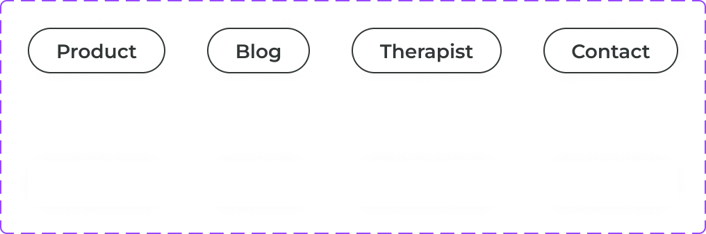
Menu

Menu items: Product, Blog, Therapist and Contact, in two styles

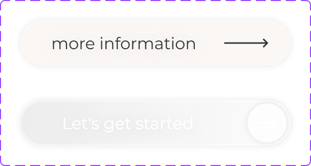
Call to action

More information and Let's get started buttons

Scroll buttons

Scroll down button in two states Scroll down button, light, in two sizes

Social

Facebook, Twitter and LinkedIn buttons

02 Molecules

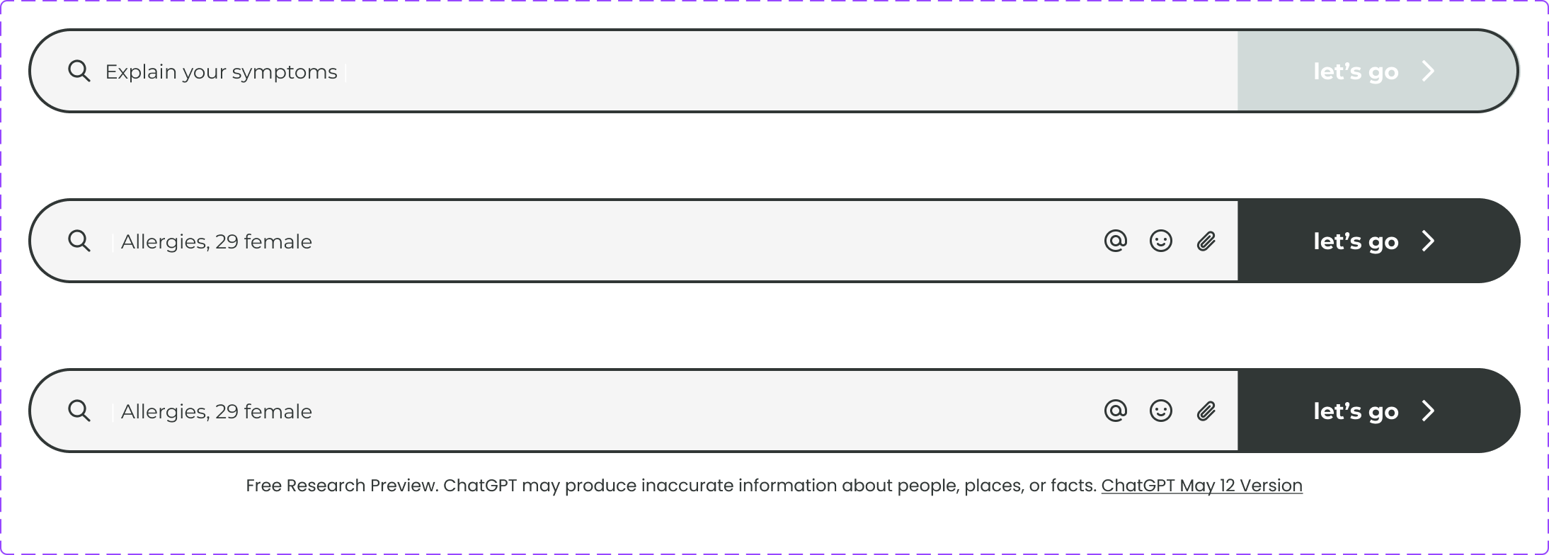
Search bar

Search bar: empty, typing and filled, with the research preview note

Progress bar

Progress bar for the two steps: We would like to know you better, and YAY! You made it!

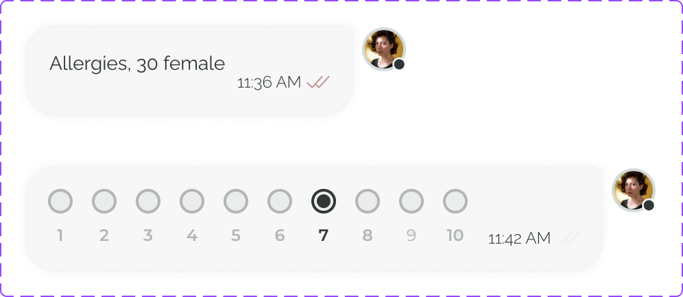
User messages

User messages: a text message and a 1 to 10 scale

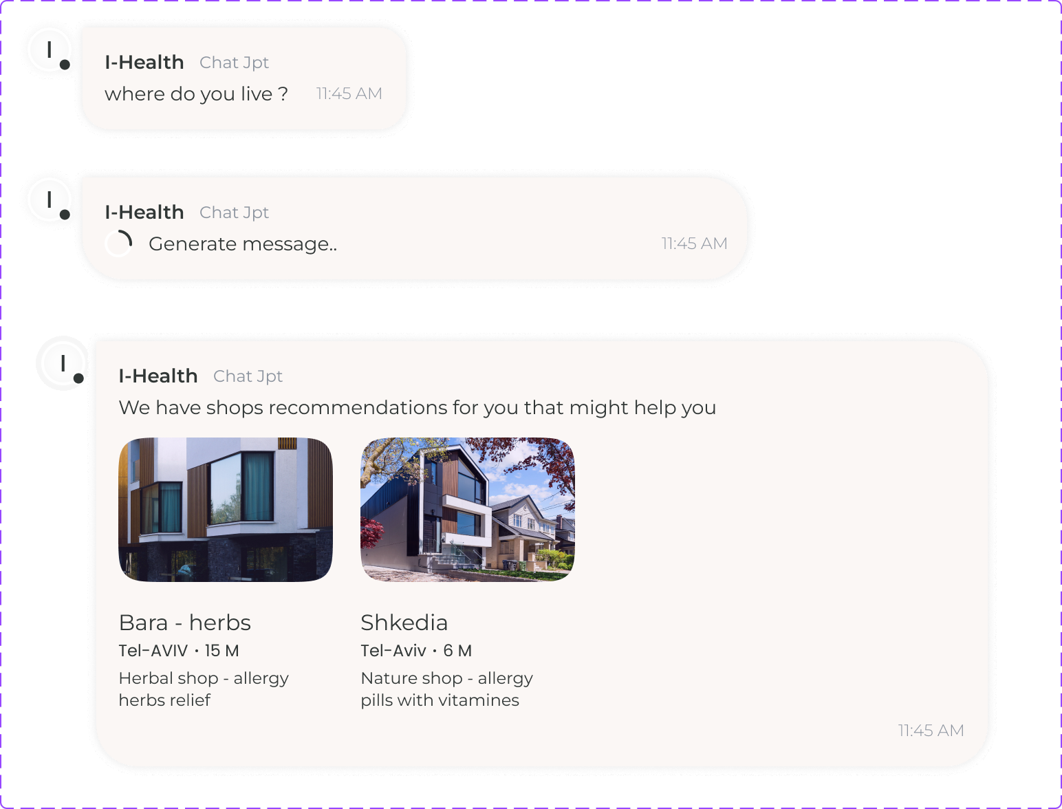
I-Health messages

I-Health messages: a question, a generating message and shop recommendations

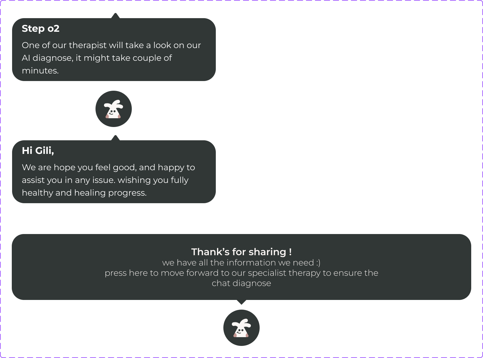
Chatbot

Chatbot messages: step two, a greeting to Gili, and thanks for sharing

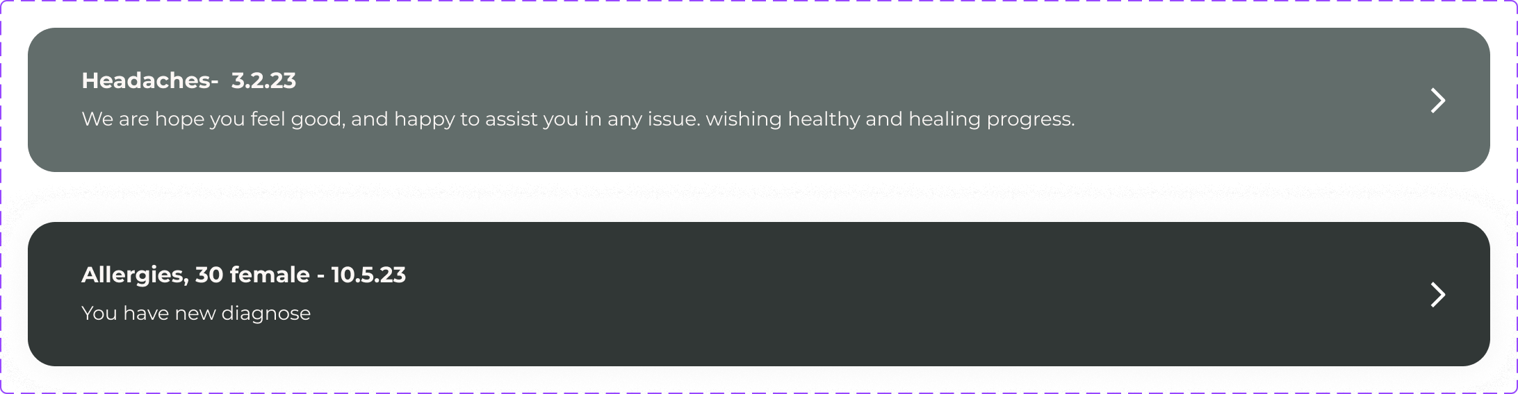
Diagnosis list

Diagnosis list items: a past diagnosis and a new one

03 Organisms

Therapist cards

Therapist cards for Jenny Owen, Claire Smith and Robin Falco

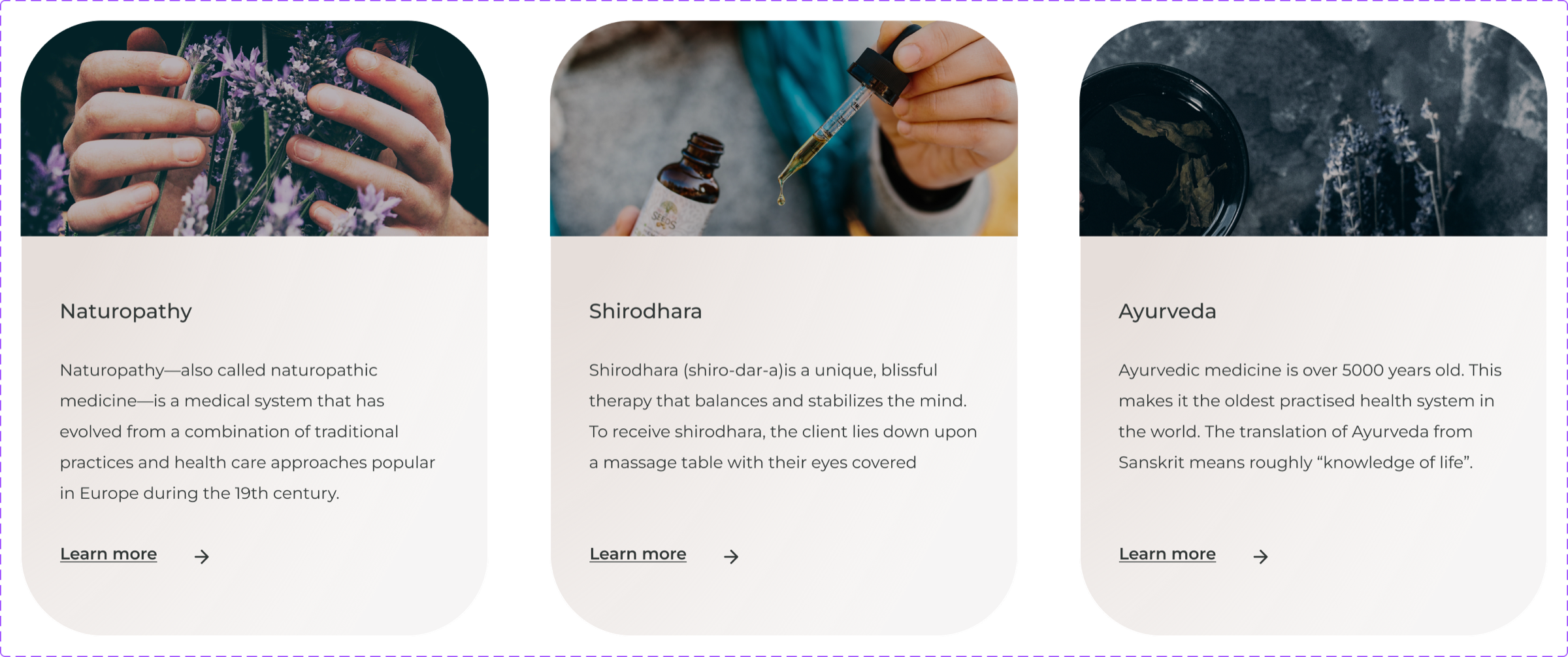
Therapy cards

Therapy cards for naturopathy, shirodhara and ayurveda

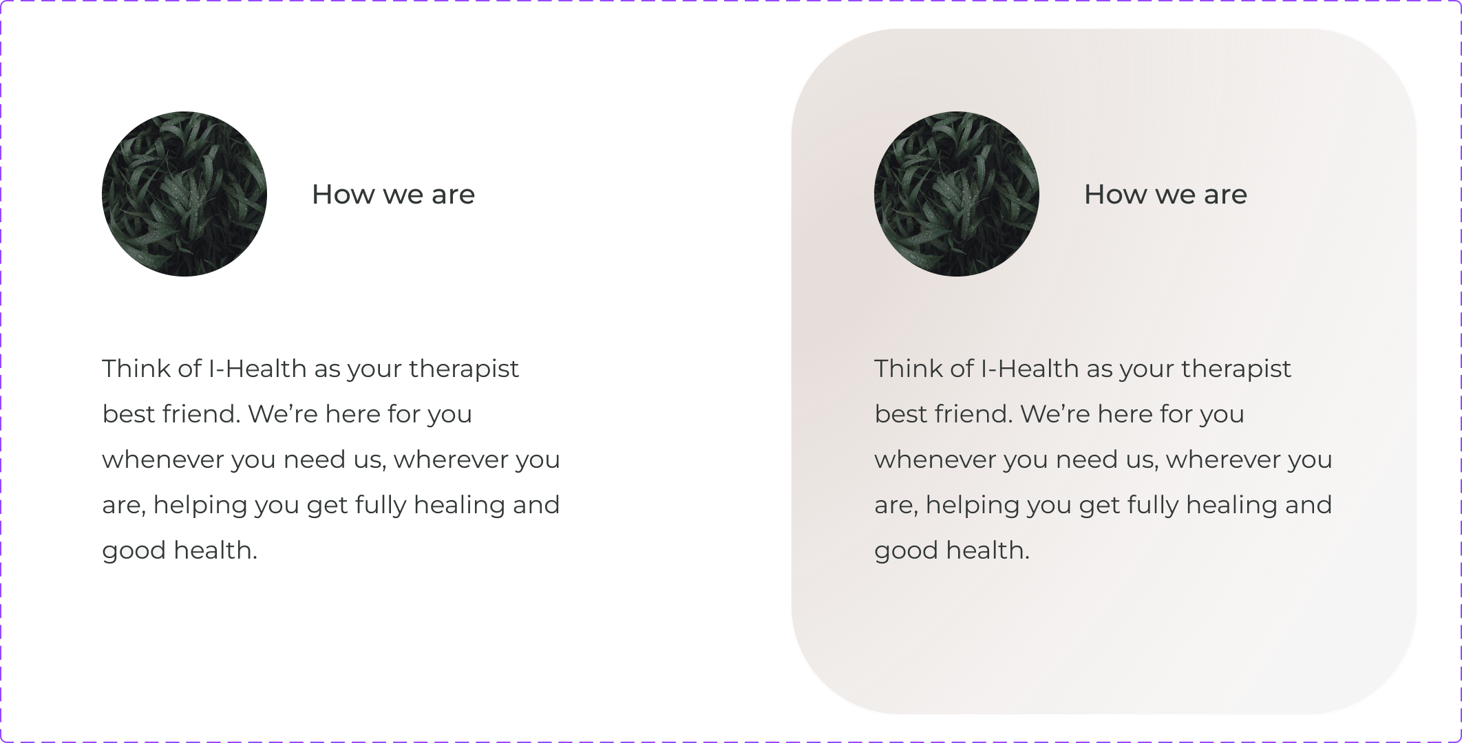
Info card

How we are info card, plain and on a card

07 — Wireframes

Hover the screensTap the screens to see the final UI

The wireframes went through many drafts before reaching this stage. Each option grew out of the platform’s concept, the usability study and new features I added along the way, and supports the platform’s values.

Homepage
Item page
Diagnosis

08 — UI design

Holistic therapy and AI, easy to trust

One of the main design goals was to bring holistic therapy and AI together, and to earn people’s trust. For the final UI, I wanted a pleasant, modern look that still feels professional and reliable. The design is clear and inviting, with gradient buttons and rounded shapes, so moving through the platform feels clear and satisfying.

Screens From wireframes to design

01 · Homepage

A first look that builds trust

The homepage is built from sections that give people a first look at what the platform does and point them in the right direction.

The goal was to spark curiosity, make the product feel familiar and earn people’s trust.

02 · Product page

A short, professional diagnosis

The goal was a light, clean and up-to-date experience that leads people to a short, professional diagnosis.

The main reference for this page was ChatGPT.

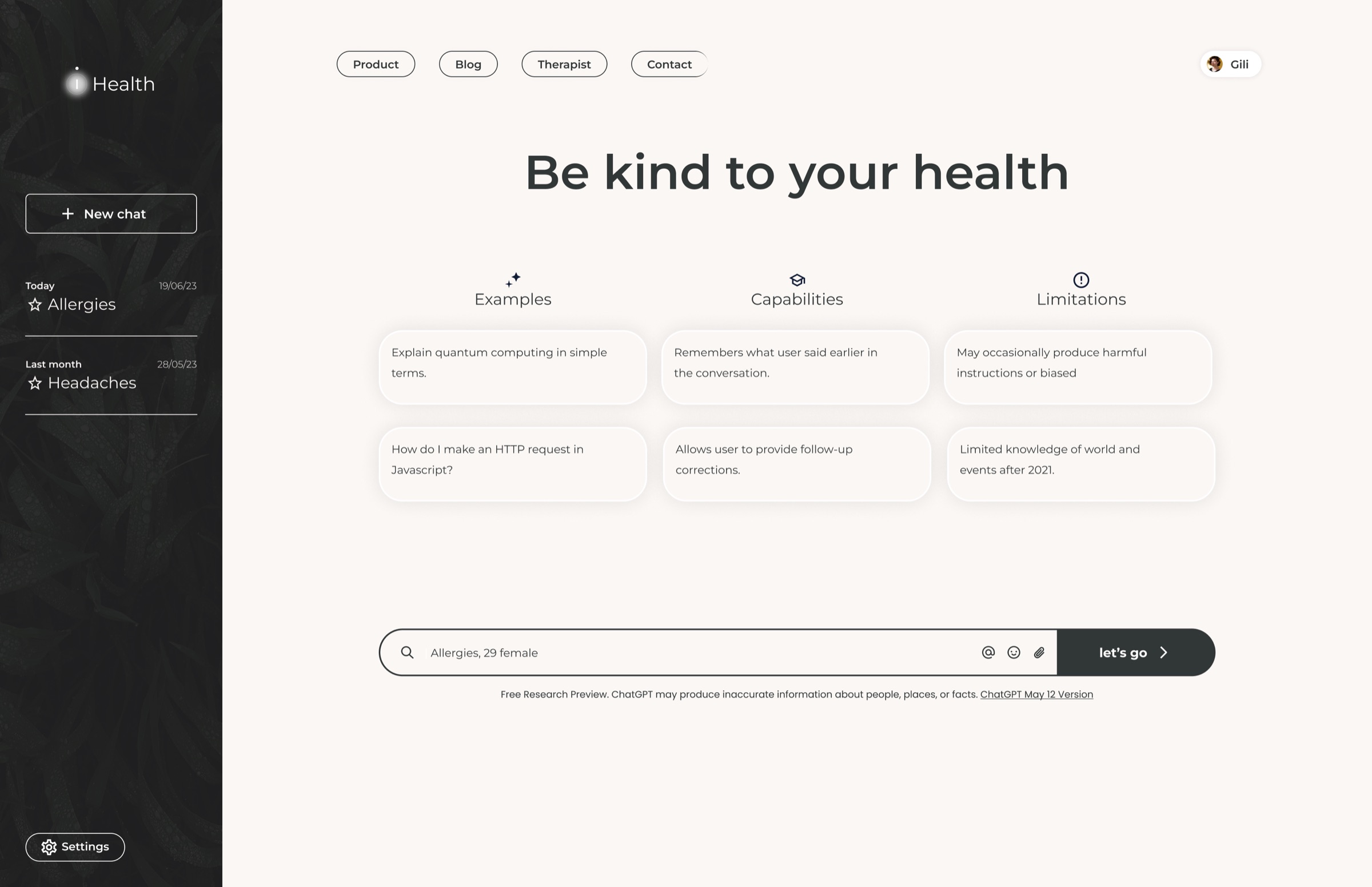
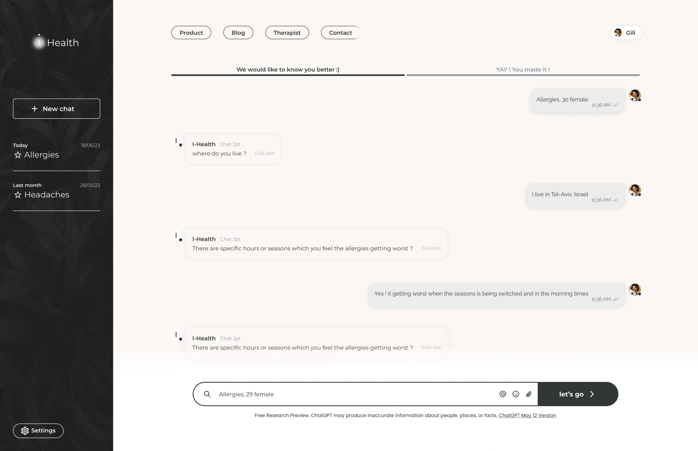
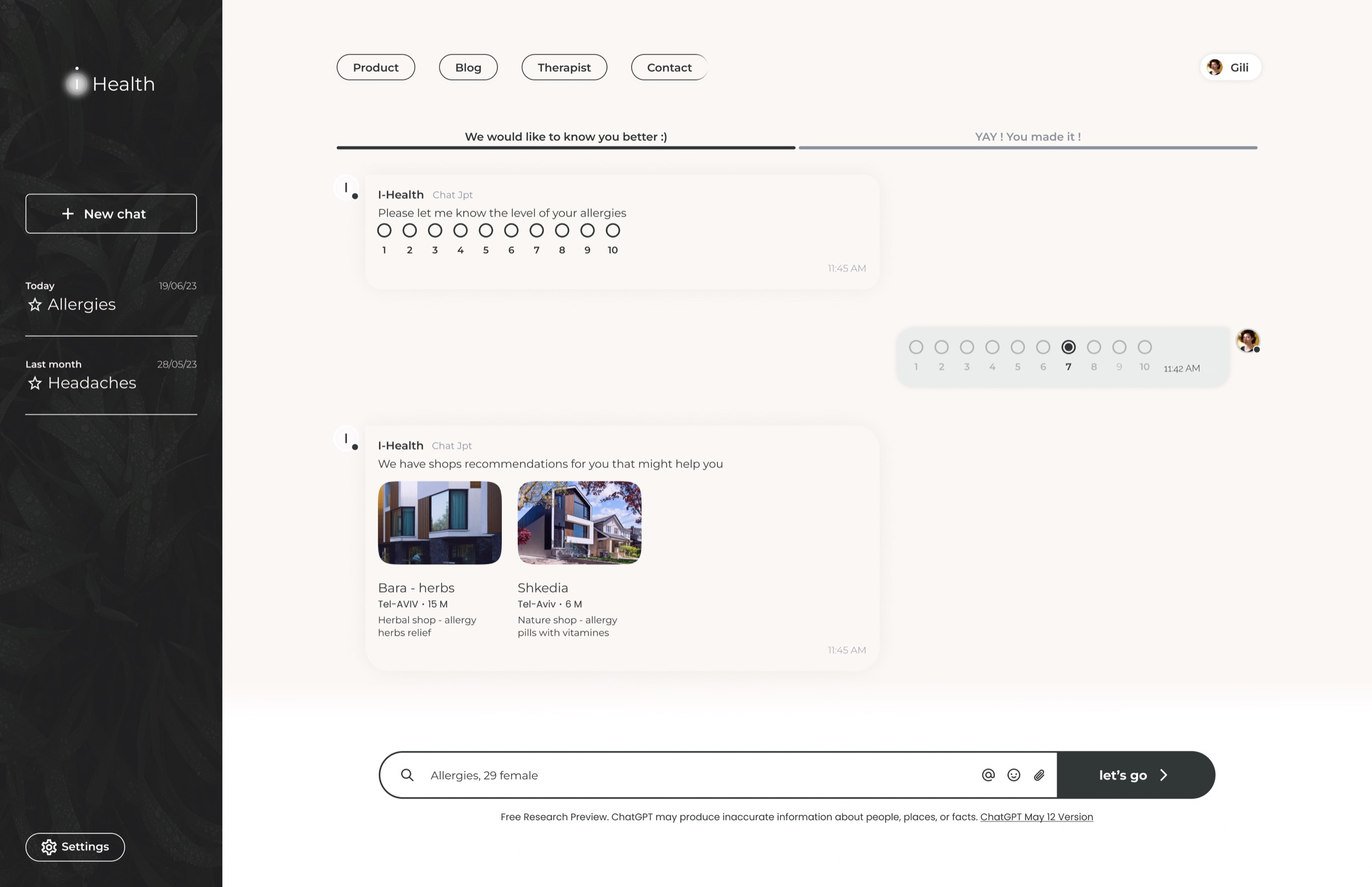
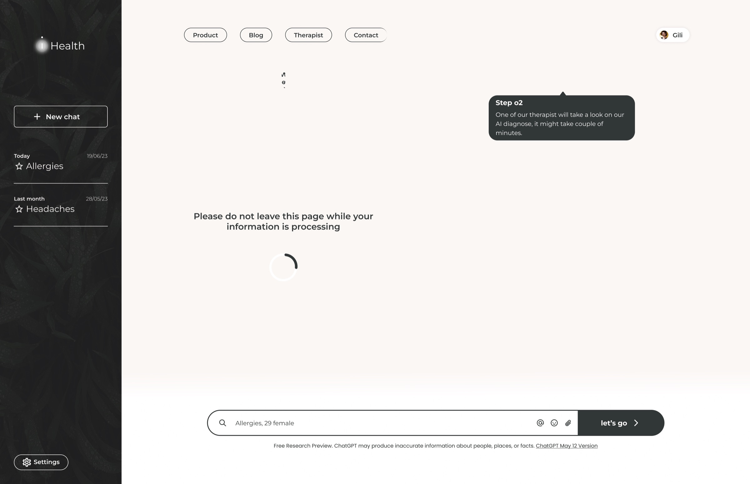
New chat screen with examples, capabilities and limitations I-Health asks follow-up questions about the allergy Chat with a 1 to 10 scale and shop recommendations Processing screen: please do not leave this page while your information is processing

03 · Profile

The whole history in one place

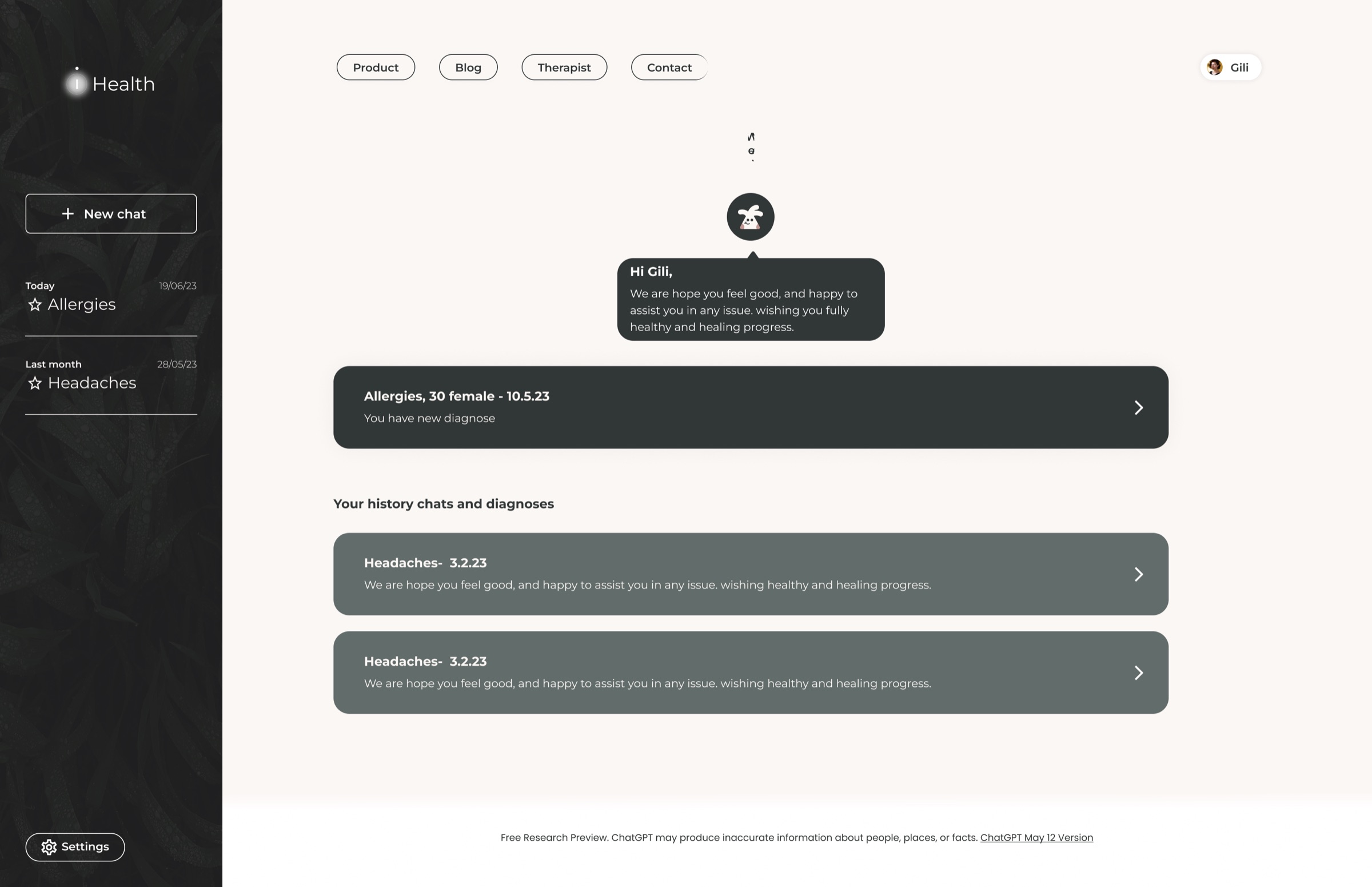
The profile page shows each person’s details together with their whole history: conversations and past diagnoses.

People can see all their private information and edit their details.

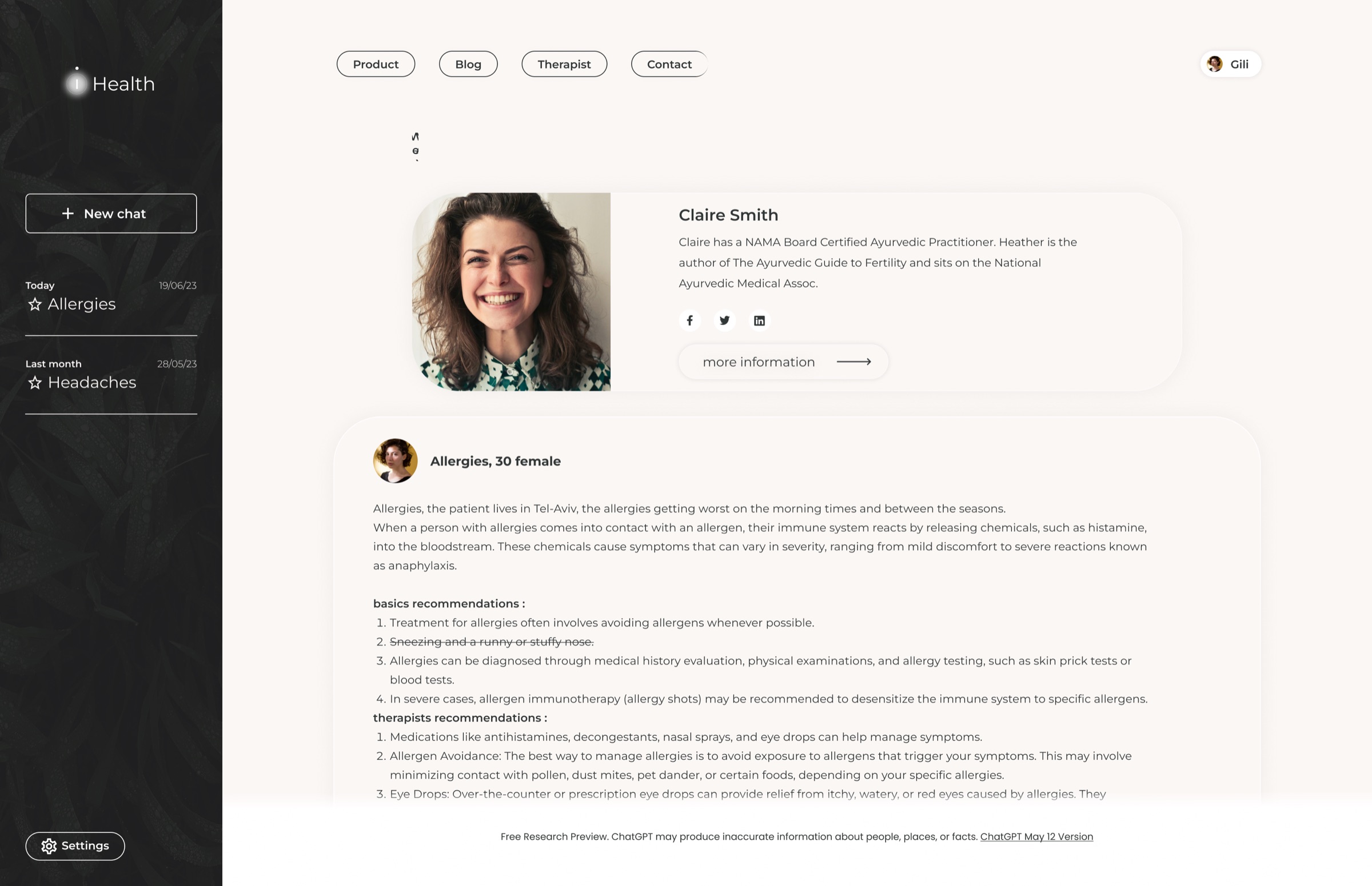
Profile with a new diagnosis and the history of chats and diagnoses A diagnosis with the certified therapist who reviewed it

Let’s create awesome
products together